Most campaigns don’t fail because of poor targeting or weak ad creative. They fail because the page that receives the click wasn’t built to convert. Understanding what are landing pages — and what separates them from every other page on your site — is the first step toward fixing a strategy that’s quietly draining your budget.
A landing page is a standalone web page built for a single campaign and a single conversion action. It sits outside your site’s normal navigation, receives traffic from a specific ad, email, or social post, and exists to move that visitor toward one outcome. That’s the entire mechanism. Not brand exploration, not general information — one action, one audience, one purpose.
This guide is built for PPC specialists, B2B marketing managers, and digital marketers who already understand the basics and want a clear framework for diagnosing and correcting that gap before 2026 campaigns go live. You’ll find the strategic definitions, the financial mechanics, the structural decisions, and the execution details that separate pages that convert from pages that cost you twice — once in wasted clicks, and again in lost revenue.
What Are Landing Pages? The Strategic Definition That Actually Drives 2026 Conversions
Most campaigns don’t lose money on the ad. They lose it in the three seconds after the click. The targeting was sound, the creative earned attention, the bid cleared the auction — and then the visitor arrived somewhere that asked them to think too hard. That gap, between what an ad promises and what the visitor actually finds, is where marketing budgets quietly disappear.
A landing page is a standalone web page built for a single campaign and a single action. It sits outside your site’s normal navigation path. Traffic arrives from a specific ad, email, or social post, and the page exists to move that traffic toward one conversion — nothing more.
That singular focus is the entire mechanism. A regular site page serves many audiences chasing many goals, so it hedges. A landing page assumes it already knows who is arriving and why, because the ad that sent them said so.
Ad platforms treat it that way too. Landing page experience is now a graded input into what you pay per click, which means page quality stopped being a design concern and became a media-buying cost. Advertisers rated “Below Average” on landing page experience pay 30% to 70% higher costs-per-click than competitors rated “Above Average.” Meanwhile the median landing page conversion rate across all industries sits at 6.6%, and pages written at a 5th to 7th-grade reading level convert at 11.1% — more than double the 5.3% rate of professional-level pages.
Those three numbers describe the same lever. Pull it well and your cost per acquisition falls twice: cheaper clicks, and more of them converting.
The Psychology of Conversion: Why Simplicity Wins
Simplification is not a stylistic preference. It is the single most reliable variable in landing page conversion rates, and the numbers behind it are blunt.
11.1% — the conversion rate of landing pages written at a 5th to 7th-grade reading level, according to Unbounce.
Reading level is a proxy for processing cost. When a visitor has to parse a subordinate clause to understand what is being offered, the brain registers effort, and effort registers as risk. Plain language does the opposite: it signals that the offer has nothing to hide, that the company understands its own product well enough to explain it simply, and that the next step will be equally easy. B2B marketers resist this hardest, assuming that technical buyers want technical prose. Technical buyers want clarity faster than anyone, because they are reading between meetings.
13.5% — the average conversion rate of landing pages with a single call to action, per Unbounce data.
A single objective works because it eliminates the deliberation stage entirely. Two offers on one page force the visitor to evaluate both, compare them, and justify a choice — three mental steps before any action occurs. One offer collapses those steps into a binary: yes or no. Binary decisions are made quickly, and speed matters because attention decays continuously from the moment of the click.
Cognitive ease and conversion velocity move together. The faster a visitor can understand the offer, believe the claim, and locate the button, the smaller the window for hesitation. Every additional word, field, or link widens that window.
How to Create a Landing Page
The landing page best practices that actually move revenue come down to a short, disciplined list:
Step 1: Goal Alignment and the ‘Jobs to be Done’ Framework
Most teams ask how to create a landing page when the prior question is what job the visitor hired your page to perform. Jobs to be Done reframes the brief around the visitor’s circumstance rather than your funnel stage, which produces sharper copy and far fewer competing elements.
Work through three steps before writing a single headline:
- Define the Situation. Capture the literal context of the click: a marketing manager between meetings, on mobile, comparing three vendors after a budget request was rejected. Situation determines page length, form depth, and tone.
- Name the Task. Identify what the visitor must accomplish today — not eventually. “Get a document credible enough to forward to my director” is a task. “Learn about our platform” is not.
- Match the Solution. Attach one action that completes the task. Awareness-stage jobs resolve with a benchmark asset or comparison sheet; decision-stage jobs resolve with pricing access or a scoped demo.
The failure mode is the multi-goal page — a demo request, a newsletter signup, and a PDF download sharing the same hero. Each additional path divides attention and depresses the metric you are optimizing. One job, one page, one action.
Step 2: Competitor Gap Analysis and Value Proposition
Your page is never judged in isolation. It is judged against the two or three rivals the prospect opens in adjacent tabs, often served by the same auction. Gap analysis makes that comparison explicit before you draft copy.
Click your own ads, then your competitors’, and audit their destination pages for the specific failures that cost them conversions: vague capability descriptions with no mechanism, no pricing signal anywhere on the page, social proof that names no company, forms demanding fifteen fields for a first touch, or a promise that ignores the keyword entirely. Each of those is an opening.
Record findings in a simple grid so the opportunity is documented rather than remembered:
| Competitor Weakness | Your Opportunity (Green Point) |
|---|---|
| Pricing hidden behind sales call | Published starting range plus scoping calculator |
| Generic “enterprise-grade” claims | Named mechanism with a documented process |
| Unattributed testimonials | Role, company, and measurable outcome |
| 15-field gated form | Three fields, progressive enrichment after |
Your unique value proposition then writes itself as the sum of the gaps you can credibly fill. State it in the hero as a claim a competitor would struggle to copy in a week.
Step 3: Audience Doubt Mapping and Persona-Based Copy
Conversion friction is rarely a design problem. It is an unanswered objection the visitor never voices. Doubt mapping forces those objections onto the page structure, assigning each one a block of copy, a proof element, or a form change.
Build the map per persona, because pains diverge sharply. A finance-adjacent buyer doubts cost justification; an operations lead doubts implementation time; a practitioner doubts whether the tool will survive their existing stack.
Personalization carries the weight here, and expectations are already set: 73% of customers feel brands treat them as unique individuals. Match register to the platform that delivered the visitor — LinkedIn traffic responds to professional risk and peer validation, TikTok traffic to direct, conversational proof. The doubt stays constant; the language answering it should not.
Step 4: High-Conversion Design and CTA Orchestration
Design decisions on a paid page serve one function: removing everything between the promise and the action. Strip global navigation, collapse secondary offers, and place the primary conversion point within the hero, then repeat it at each logical decision moment down the page.
Pro Tip:
Personalized CTAs perform 202% better than basic, non-personalized versions, so treat button copy as a variable driven by segment rather than a fixed asset. A visitor arriving from a bottom-funnel search term should see an action naming their specific outcome; a cold prospecting audience should see a lower-commitment step. Dynamic text replacement makes this operationally cheap once the parameter structure is defined.
Build mobile-first, since paid social traffic arrives there by default and rendering delays punish the auction as much as the user. Compress hero media, defer non-critical scripts, and validate that forms remain usable on small viewports.
Directional cues — sightlines in imagery, whitespace channels, contrast reserved exclusively for the button — pull the eye toward that action. Generative tools can produce copy variants at volume, but the segment logic, offer structure, and doubt sequencing stay human decisions.
Step 5: Legal Compliance and Platform Trust Signals
Ad platforms review destination pages as rigorously as creative, and disapproval at scale is a revenue event. Compliance is also a ranking input: pages that disclose clearly and load securely support a stronger Quality Score, which lowers what you pay per click.
Work this checklist before any campaign goes live:
- Privacy Policy linked in the footer and adjacent to every form, describing what data is collected and how it is used.
- Terms of Service accessible from the same footer, covering service scope and limitations.
- Refund or Cancellation Policy published where a transaction or subscription is involved.
- Consent mechanism for lead capture meeting GDPR and CCPA standards — explicit opt-in, unbundled from form submission, with a documented record.
- Data handling disclosure naming third-party processors that receive form data, including your CRM and enrichment tools.
- Valid SSL certificate with no mixed-content warnings on any asset.
- Verifiable business identity: legal entity name, physical address, and a contact method that resolves to a human.
- Claim substantiation for any performance or earnings statement made in ad copy or on the page.
Modern Workflows: Using AI and ChatGPT for Landing Pages
AI has genuinely changed the front end of landing page production. It has changed almost nothing about the back end. A language model can draft copy and output HTML, but it cannot host a page, connect a form to your CRM, install tracking, or run the split test. Those remain jobs for a builder, a CMS, and a person who understands the campaign.
A workflow that actually holds up:
- Ideation. Feed the model your offer, audience, the exact ad copy driving traffic, and the top three objections your sales team hears. Ask for 15 headline angles, not one. Volume is where AI earns its keep.
- Copy refinement. Pick two or three angles and have the model develop them into full page sections. Then rewrite by hand. Set an explicit reading-level constraint and enforce it yourself, because models drift toward formal register.
- Structural drafting. Use AI to produce wireframe copy blocks — hero, proof, objection handling, CTA — so you’re arranging content rather than staring at a blank page.
- Porting to a CMS. Move the approved copy into your landing page builder or site. Connect the form, add the conversion pixel, test on a real phone, publish.
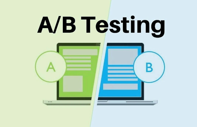
Where AI does pay off reliably is variant generation for A/B
The Bottom Line: 2026 Landing Page Essentials
For teams that need the argument compressed into something they can take into a budget meeting, here’s what the evidence actually says.
What are website landing pages, in the most useful sense? They’re standalone, campaign-specific destinations built for one action — sitting outside normal site navigation, reached from a specific ad, email, or post rather than by browsing. That definition isn’t semantic. It’s the structural reason they outperform every other page type for paid traffic.
Five points carry the full argument:
- Landing pages beat homepages for paid traffic because they remove choice. A homepage serves every audience and every goal at once. A landing page assumes it already knows who arrived and why, and eliminates every exit that isn’t the conversion.
- Reading level is a conversion variable, not a style preference. Pages written at a 5th to 7th-grade level convert at 11.1% versus 5.3% for professional-level copy — simplifying language can roughly double results without touching design, offer, or targeting.
- Weak page experience raises what you pay per click. Advertisers rated “Below Average” on landing page experience pay 30% to 70% higher CPCs than those rated “Above Average,” which makes page optimization a cost-control measure before it’s a growth tactic.
- Architecture must match where the conversion actually happens. If money changes hands elsewhere, build a click-through page. If the goal is a contact record, build a lead gen page. Choosing the wrong structure creates friction no amount of copy work will fix.
- AI accelerates ideation and variant generation; it doesn’t run your campaign. Use it for headline volume, draft structure, and A/B test variations, then apply human judgment to strategy, brand voice, and the technical work of hosting, form integration, and tracking.
The connective logic across all five points is the same. A landing page is the bridge between what your ad promised and what your business earns. Every other part of a paid campaign — targeting, bidding, creative — only pays off if that bridge holds. When conversion rates disappoint, the page is where to look first, because it’s the one place where poor performance costs you twice: once in wasted clicks, and again in lost revenue.